本記事には以下の アップデート版があります。TypeScript を用いた、より網羅的な内容になっています。
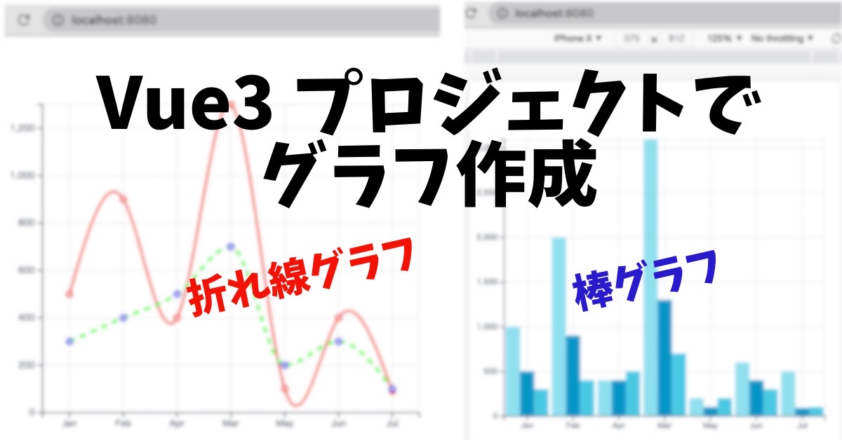
Vue3 で “折れ線グラフ” 、 “棒グラフ” などの “チャート” を描画したいときに Vue3-Charts を使うことで簡単に実装することができます。今回は、 Vue CLI で作成した Vue3 プロジェクトで Vue3-Charts を用いて折れ線グラフ, 棒グラフ を作成する方法を紹介します。
Vue CLI プロジェクトの作成と Vue3 Charts のインストール
Vue CLI プロジェクトの作成
まずは、ベースとなる Vue CLI プロジェクトを作成していきます。 vue create コマンドを使って以下のように Vue 3 のプロジェクトを作成します。
% vue create [プロジェクト名]

? Please pick a preset:
  Default ([Vue 2] babel, eslint)
❯ Default (Vue 3 Preview) ([Vue 3] babel, eslint)
  Manually select features
Vue3 Charts のインストール
公式サイトの情報に基づいて以下のようにインストールしていきます。
% npm install vue3-charts --save
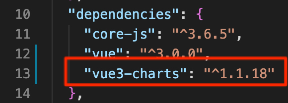
package.json の dependencies が以下のように更新されました。
事前準備は以上で終了です。それでは早速グラフを作成していきましょう。
折れ線グラフ, 棒グラフ の作成準備
グラフ表示用コンポーネントの作成
グラフを作成する前に、グラフを表示するためのコンポーネントを用意します。 components ディレクトリ配下に Charts.vue を新規作成し、それに合わせて App.vue の内容を変更します。
components / Charts.vue
<template>
   <div>
       <h1>Charts</h1>
   </div>
</template>
App.vue
<template>
 <Charts />
</template>
<script>
import Charts from './components/Charts.vue'

export default {
 name: 'App',
 components: {
   Charts
 }
}
</script>
<style>
#app {
 font-family: Avenir, Helvetica, Arial, sans-serif;
 -webkit-font-smoothing: antialiased;
 -moz-osx-font-smoothing: grayscale;
 text-align: center;
 color: #2c3e50;
 margin-top: 60px;
}
</style>
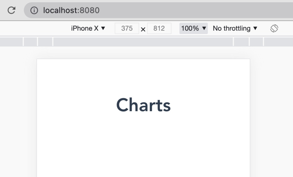
ここまでの状態で npm run serve コマンドで起動してみます。
それではここにグラフを追加していきます。まずは折れ線グラフを追加してみます。
折れ線グラフ の実装
Getting Started どおりの実装
折れ線グラフ ( Line Chart ) については、こちらを参考に作成していきます。まずは何も考えずに Getting Started の内容で作成してみます。
components / Charts.vue
<template>
 <Chart
   :size="{ width: 500, height: 400 }"
   :data="data"
   :margin="margin"
   :direction="direction">

   <template #layers>
     <Grid strokeDasharray="2,2" />
     <Line :dataKeys="['name', 'pl']" />
   </template>

 </Chart>
</template>
<script lang="ts">
import { defineComponent, ref } from 'vue'
import { Chart, Grid, Line } from 'vue3-charts'
import { plByMonth } from '@/data'

export default defineComponent({
 name: 'LineChart',
 components: { Chart, Grid, Line },
 setup() {
   const data = ref(plByMonth)
   const direction = ref('horizontal')
   const margin = ref({
     left: 0,
     top: 20,
     right: 20,
     bottom: 0
   })

   return { data, direction, margin }
 }
})
</script>
<style>
#app {
 color: #2ecc71
}
</style>
data
src ディレクトリ直下に data ファイルを忘れずに作成します。
export const plByMonth = [
 { name: 'Jan', pl: 1000, avg: 500, inc: 300 },
 { name: 'Feb', pl: 2000, avg: 900, inc: 400 },
 { name: 'Apr', pl: 400, avg: 400, inc: 500 },
 { name: 'Mar', pl: 3100, avg: 1300, inc: 700 },
 { name: 'May', pl: 200, avg: 100, inc: 200 },
 { name: 'Jun', pl: 600, avg: 400, inc: 300 },
 { name: 'Jul', pl: 500, avg: 90, inc: 100 }
]
プロジェクトの構成は以下のようになっています。
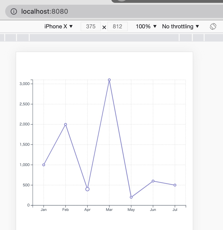
折れ線グラフ の表示
この状態で起動してみます。ほんの少しのコード量ながらとてもきれいなグラフが描画されています。
理解を深めるために、このグラフを基にカスタマイズしてみます。
系列(折れ線)の追加
data には先程表示した折れ線のデータ以外にも系列として使えるデータがありますので、系列を追加してみます。
Charts.vue
data から avg のデータを赤色で追加してみます。あわせて折れ線のタイプを natural として指定してみます。
<template>
 <Chart
   :size="{ width: 500, height: 400 }"
   :data="data"
   :margin="margin"
   :direction="direction">

   <template #layers>
     <Grid strokeDasharray="2,2" />
     <Line :dataKeys="['name', 'pl']" />
     <Line :dataKeys="['name', 'avg']" :lineStyle="{ stroke: 'red' }" type="natural" />
   </template>

 </Chart>
</template>
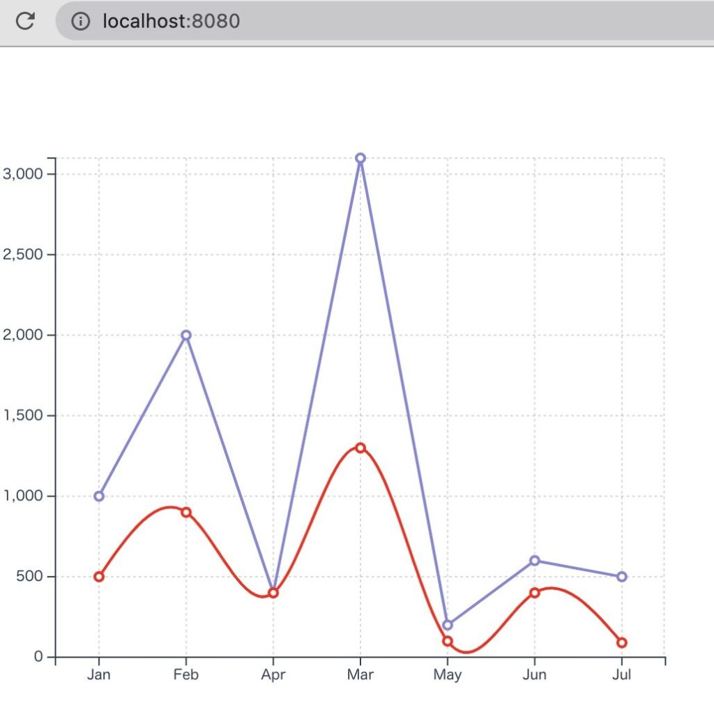
折れ線グラフ の表示
緩やかなカーブで表現された赤色の折れ線グラフが追加されました。
色々なプロパティを試してみる
こちらに記載されているプロパティを色々試してみます。先程追加した赤い折れ線を残し、新しい折れ線を追加してみます。
Charts.vue
<template>
 <Chart
   :size="{ width: 500, height: 400 }"
   :data="data"
   :margin="margin"
   :direction="direction"
 >
   <template #layers>
     <Grid strokeDasharray="2,2" />
     <Line :dataKeys="['name', 'avg']" :lineStyle="{ stroke: 'red' }" type="natural" />
     <Line
       :dataKeys="['name', 'inc']"
       :lineStyle="{
         stroke: 'lime',
         strokeWidth: 3.2,
         strokeDasharray: 6.8,
       }"
       :dotStyle="{
         stroke: 'blue',
         strokeWidth: 2,
       }"
       type="monotone"
     />
   </template>
 </Chart>
</template>
折れ線グラフ の表示
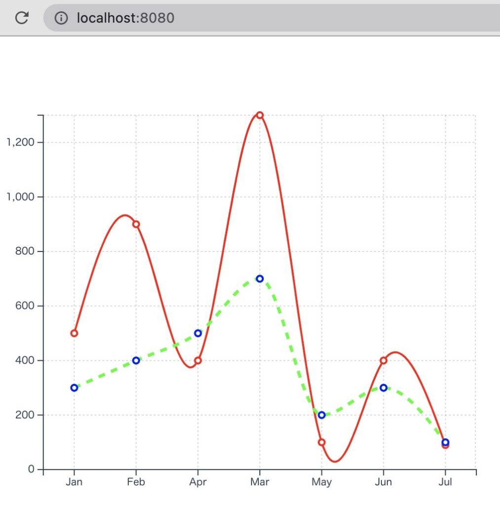
ここでのポイントを整理します
- データの最大値に合わせて、グラフの最大値も調整される
- strokeWidth, strokeDasharray は数値(小数点)で指定
- monotone は、2点間をなだらかにつなぎ、natural は系列全部をなだらかにつなぐ
棒グラフ の実装
公式ドキュメント通りの実装
棒グラフも公式ドキュメントで紹介されている通りに実装してみます。
Charts.vue
Charts.vue の template 部分を以下のコードで差し替えてみます。
<template>
 <Chart
   :size="{ width: 500, height: 420 }"
   :data="data"
   :margin="margin"
   :direction="direction"
   :axis="axis">

   <template #layers>
     <Grid strokeDasharray="2,2" />
     <Bar :dataKeys="['name', 'pl']" :barStyle="{ fill: '#90e0ef' }" />
     <Bar :dataKeys="['name', 'avg']" :barStyle="{ fill: '#0096c7' }" />
     <Bar :dataKeys="['name', 'inc']" :barStyle="{ fill: '#48cae4' }" />
     <Marker :value="1000" label="Avg." color="#e76f51" strokeWidth="2" strokeDasharray="6 6" />
   </template>

   <template #widgets>
     <Tooltip
       borderColor="#48CAE4"
       :config="{
         pl: { color: '#90e0ef' },
         avg: { color: '#0096c7' },
         inc: { color: '#48cae4' }
       }"
     />
   </template>

 </Chart>
</template>
公式ドキュメントには誤記があるようですが、 script について、 “Line” とある部分は “Bar” に差し替えます。
<script lang="ts">
import { defineComponent, ref } from "vue";
import { Chart, Grid, Bar } from "vue3-charts";
import { plByMonth } from "@/data";

export default defineComponent({
 name: "LineChart",
 components: { Chart, Grid, Bar },
 setup() {
   const data = ref(plByMonth);
   const direction = ref("horizontal");
   const margin = ref({
     left: 0,
     top: 20,
     right: 20,
     bottom: 0,
   });

   return { data, direction, margin };
 },
});
</script>
棒グラフ の表示
この状態で起動すると、以下のような棒グラフが描画されます。
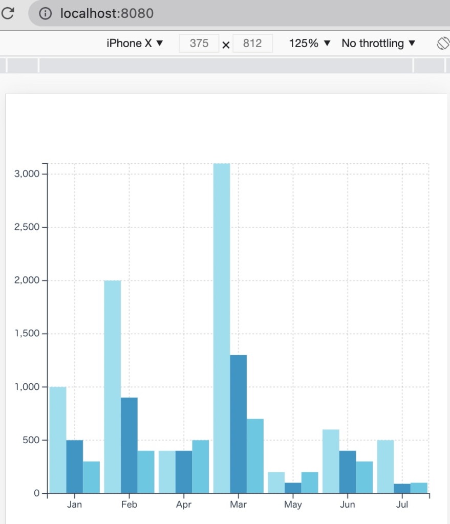
棒グラフにもプロパティとして設定できるパラメータがあり、カスタマイズすることが可能です。
まとめ
Vue.js を使ってグラフを作成できるといいなと思っていたところ、見つけた Vue3 Charts ですが、想像以上に簡単かつきれいなグラフを描画できました。今回紹介した “折れ線グラフ”, “棒グラフ” 以外にも Area Graph (面グラフ)も作成できるようです。
- Vue3-Charts を用いることで、Vue3 で各種グラフを作成することが可能
- グラフ表示領域自体は Chart でパラメータを指定することでカスタマイズ可能
- グラフそのものは Line, Bar, Area でパラメータを指定することでカスタマイズ可能